Chapter 4 Data visualisation
library(tidyverse) # 方便使用其中的 ggplot24.1 初识 ggplot
view(mpg) # 使用 view() 函数可以方便观察对应数据集
head(mpg) # 可以在控制台打印数据集头部信息(前十行)
#> # A tibble: 6 × 11
#>   manufacturer model displ  year   cyl trans      drv     cty   hwy fl    class
#>   <chr>        <chr> <dbl> <int> <int> <chr>      <chr> <int> <int> <chr> <chr>
#> 1 audi         a4      1.8  1999     4 auto(l5)   f        18    29 p     compa…
#> 2 audi         a4      1.8  1999     4 manual(m5) f        21    29 p     compa…
#> 3 audi         a4      2    2008     4 manual(m6) f        20    31 p     compa…
#> 4 audi         a4      2    2008     4 auto(av)   f        21    30 p     compa…
#> 5 audi         a4      2.8  1999     6 auto(l5)   f        16    26 p     compa…
#> 6 audi         a4      2.8  1999     6 manual(m5) f        18    26 p     compa…
列 displ:汽车的发动机尺寸,以升为单位。 列 hwy:汽车在高速公路上的燃油效率,以英里 / 加仑(mpg)为单位
ggplot(data = mpg) + # 统一设置想要处理的数据集
    # 绘制 point,mapping 属性用来设置相关的 x 轴和 y 轴参数
    geom_point(mapping = aes(x = displ, y = hwy))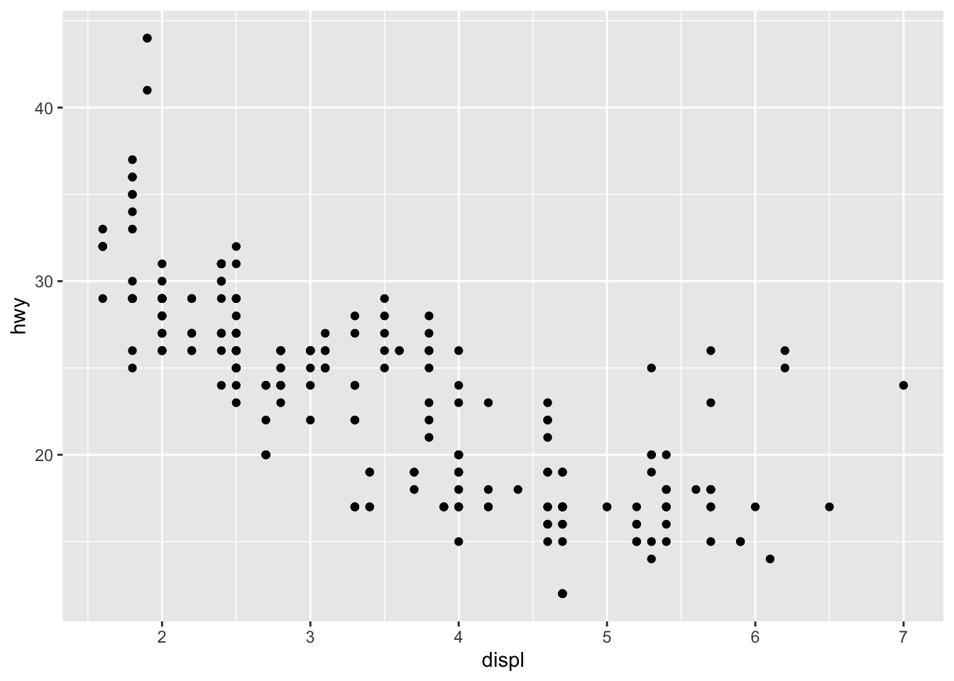
4.2 美学映射
使用颜色映射:
ggplot(data = mpg) +
    geom_point(mapping = aes(x = displ, y = hwy, color = class))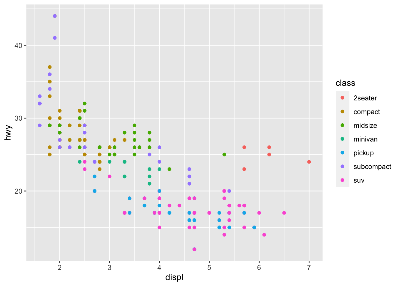
使用大小映射(不建议):
ggplot(data = mpg) +
    geom_point(mapping = aes(x = displ, y = hwy, size = class))
#> Warning: Using size for a discrete variable is not advised.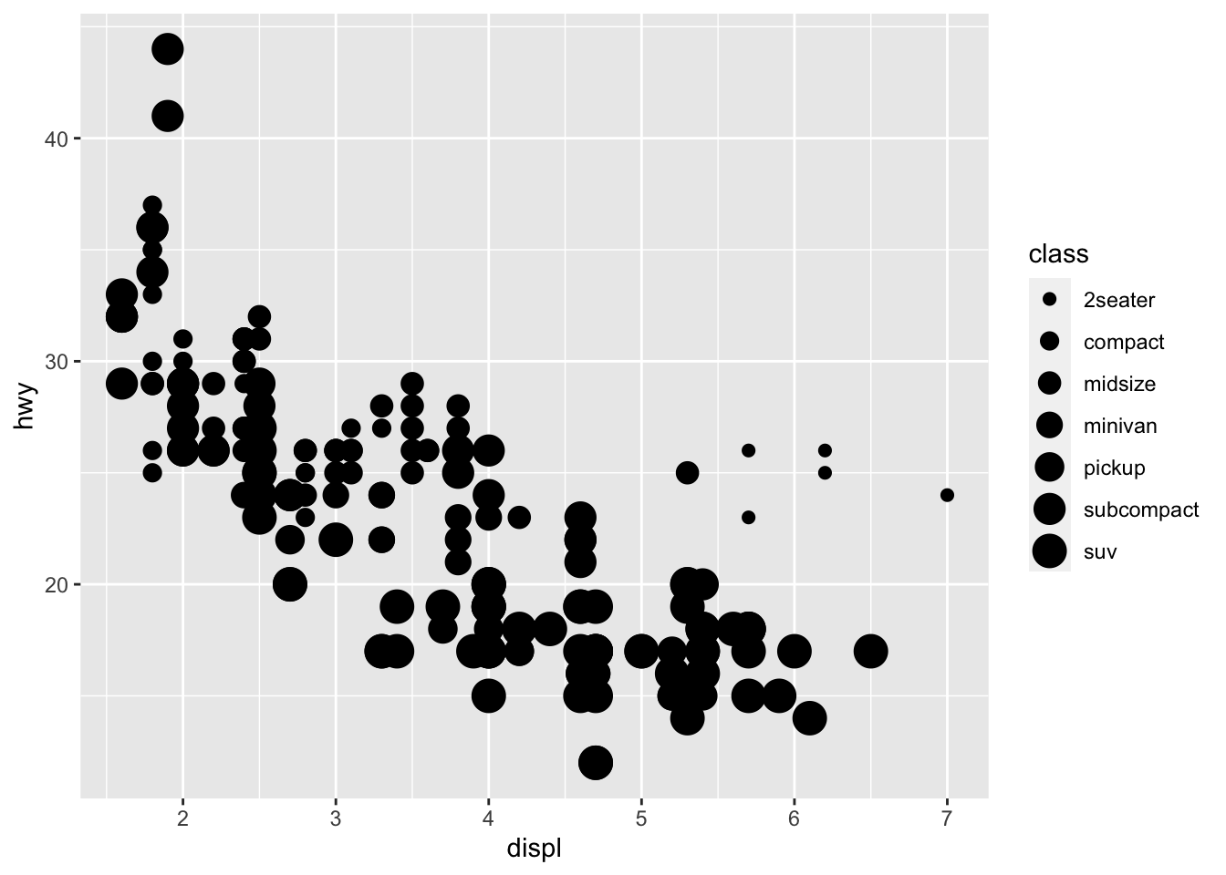
使用形状映射(注意最多只支持 6 种):
ggplot(data = mpg) +
    geom_point(mapping = aes(x = displ, y = hwy, shape = class))
#> Warning: The shape palette can deal with a maximum of 6 discrete values because
#> more than 6 becomes difficult to discriminate; you have 7. Consider
#> specifying shapes manually if you must have them.
#> Warning: Removed 62 rows containing missing values (`geom_point()`).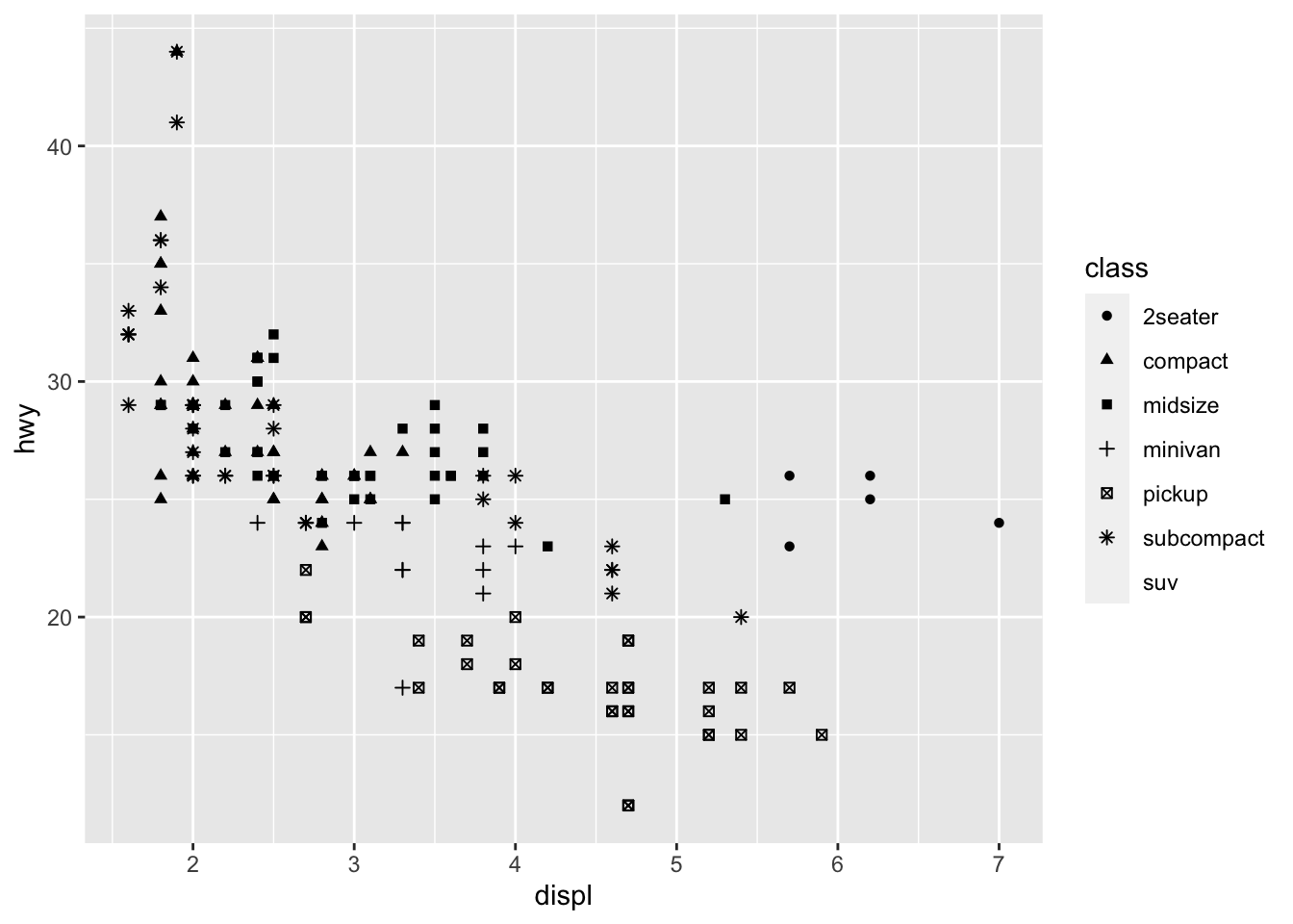
使用透明度映射(不建议):
ggplot(data = mpg) +
    geom_point(mapping = aes(x = displ, y = hwy, alpha = class))
#> Warning: Using alpha for a discrete variable is not advised.
4.3 修改样式
例如颜色:
ggplot(data = mpg) +
    geom_point(mapping = aes(x = displ, y = hwy), color = "blue")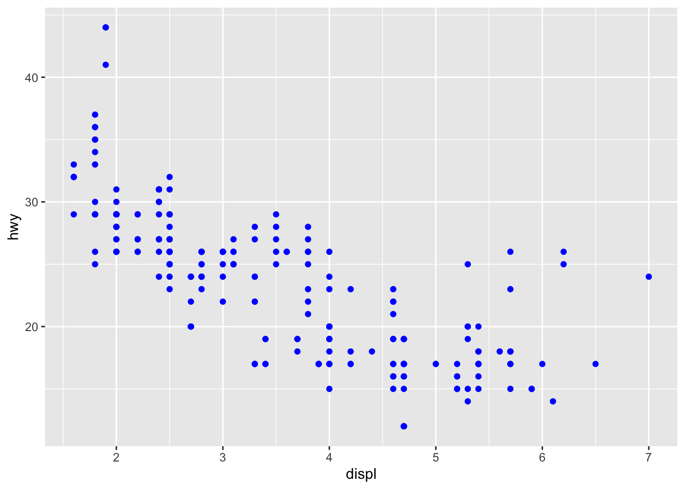
支持参数:color,shape,fill,stroke(点的粗细),linetype 等。同时,样式参数支持变量。注意 shape 填写时是填写数字,有 21 种。
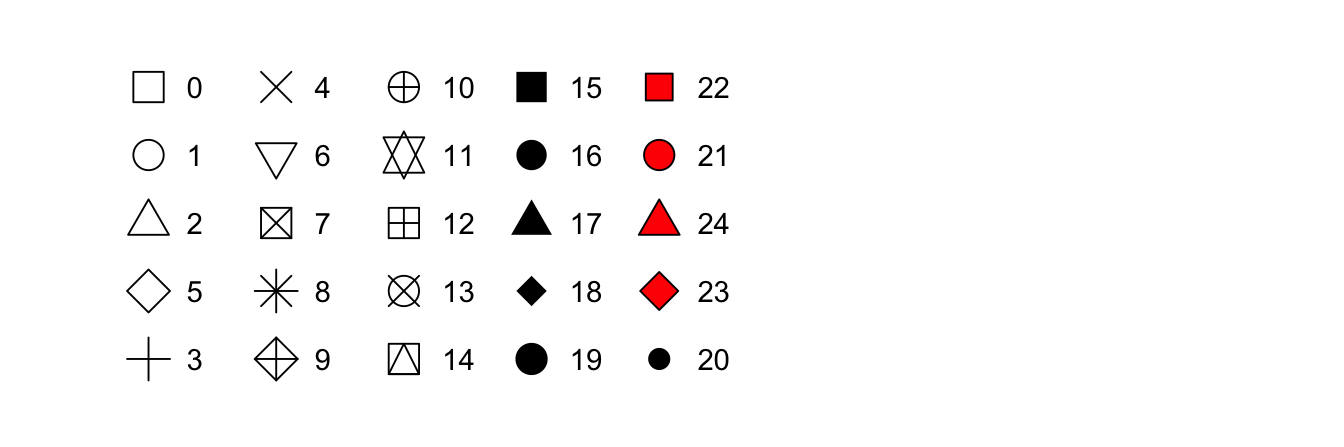
R 有 25 个内置形状,这些形状由数字标识。有一些看似重复的:例如,0、15 和 22 都是正方形。不同之处在于“颜色”和“填充”美学的相互作用。空心形状(0–14)具有由“颜色”确定的边框;固体形状(15–20)填充有“颜色”;填充的形状(21–24)具有“颜色”边框,并用“填充”填充填充。
4.4 多组画图
简单分组(分片):
ggplot(data = mpg) +
    geom_point(mapping = aes(x = displ, y = hwy)) +
facet_wrap(~class, nrow = 3) # 以 class 分类,三列,不限制行-1.png)
自定义条件分组:
ggplot(data = mpg) +
    geom_point(mapping = aes(x = displ, y = hwy)) +
facet_grid(drv ~ cyl) # 以 drv 为 x 轴,cyl 为 y 轴-1.png)
4.5 叠加与参数
mapping 为默认接收内容,可以省略:
ggplot(data = mpg) +
    geom_point(aes(x = displ, y = hwy)) +
    geom_smooth(aes(x = displ, y = hwy))
#> `geom_smooth()` using method = 'loess' and formula = 'y ~ x'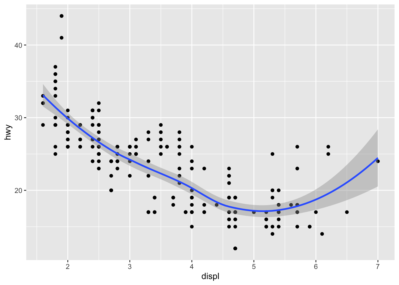
其中 mapping 写在基本配置项中,方便绘图自动调用
ggplot(data = mpg, mapping = aes(x = displ, y = hwy)) +
    geom_point() +
    geom_smooth()
#> `geom_smooth()` using method = 'loess' and formula = 'y ~ x'
绘图时使用自定义 data 覆盖默认 data 配置(filter 为筛选数据):
ggplot(data = mpg, mapping = aes(x = displ, y = hwy)) +
    geom_point(color = "blue") +
    geom_smooth(data = filter(mpg, class == "subcompact"))
#> `geom_smooth()` using method = 'loess' and formula = 'y ~ x'
4.6 其他常见图
4.6.1 回归曲线图
回归曲线有它专门的配置项,其中 show legend 用于控制现实图例显示与否,se 控制自信指数(半透明带)显示与否:
ggplot(data = mpg) +
    geom_smooth(
        mapping = aes(x = displ, y = hwy, color = drv),
        show.legend = FALSE,
        se = FALSE
    )
#> `geom_smooth()` using method = 'loess' and formula = 'y ~ x'-1.png)
4.6.2 条形图
ggplot(data = diamonds) +
geom_bar(mapping = aes(x = cut, colour = cut)) # colour 为描边颜色-1.png)
ggplot(data = diamonds) +
geom_bar(mapping = aes(x = cut, fill = cut)) # fill 为填充颜色-2.png)
但如果 fill 使用的是其他变量,会导致不同数据重叠遮挡
ggplot(data = diamonds) +
geom_bar(mapping = aes(x = cut, fill = clarity))-1.png)
解决方案 1:降低透明度
ggplot(data = diamonds, mapping = aes(x = cut, fill = clarity)) +
geom_bar(alpha = 1 / 5, position = "identity")%20with%20alpha-1.png)
解决方案 2:直接改为 colour 样式,并将 fill 设置为 NA
ggplot(data = diamonds, mapping = aes(x = cut, colour = clarity)) +
geom_bar(fill = NA, position = "identity")%20with%20color-1.png)
解决方案 3:position 改用 fill 为频率图(方便观察比例)
ggplot(data = diamonds, mapping = aes(x = cut, fill = clarity)) +
geom_bar(position = "fill")%20with%20position%20fill-1.png)
解决方案 4:position 改用 dodge 为分柱图
ggplot(data = diamonds, mapping = aes(x = cut, fill = clarity)) +
geom_bar(position = "dodge")%20with%20position%20dodge-1.png)
4.6.3 Summary 线条信息图
这种图不太常用,因为 boxplot 图拥有它的所有特性,甚至做得更好:
ggplot(data = diamonds) +
    stat_summary(
        mapping = aes(x = cut, y = depth),
        fun.max = max, # 上限最大值
        fun.min = min, # 下限为最小值
        fun.y = mean # 标点为平均数
    )
#> Warning: The `fun.y` argument of `stat_summary()` is deprecated as of ggplot2 3.3.0.
#> ℹ Please use the `fun` argument instead.
#> This warning is displayed once every 8 hours.
#> Call `lifecycle::last_lifecycle_warnings()` to see where this warning was
#> generated.-1.png)
4.7 坐标系相关
对调坐标轴:
ggplot(data = mpg, mapping = aes(x = class, y = hwy)) +
    geom_boxplot() +
coord_flip()-1.png)
根据相关图像限制图形的纵横比例:
nz <- map_data("nz") # 从 map_data 里调用某国的地图
ggplot(nz, aes(long, lat, group = group)) +
    geom_polygon(fill = "white", colour = "black") +
coord_quickmap() # 这里会使图表以正确的横纵比显示,防止图像拉伸扭曲-1.png)
极坐标化:
ggplot(data = diamonds) +
    geom_bar(
        mapping = aes(x = cut, fill = cut),
        show.legend = FALSE, # 隐藏图例,原因是 x 轴默认已经带指示了
        width = 1
    ) +
coord_polar() # 设置为极坐标(有点像圆饼图)-1.png)
4.8 绘制 diamonds 数据分析图
原题目:Recreate the R code necessary to generate the following graphs.
建立列表,绘制好 6 张图并装配进去:
p <- list()
p[[1]] <- ggplot(mpg, aes(x = displ, y = hwy)) +
    geom_point() +
    geom_smooth(se = FALSE) # 注意包含回归曲线
p[[2]] <- ggplot(mpg, aes(x = displ, y = hwy)) +
    geom_smooth(mapping = aes(group = drv), se = FALSE) + # 以 drv 分组作出多条回归线
    geom_point()
p[[3]] <- ggplot(mpg, aes(x = displ, y = hwy, colour = drv)) + # 全局以 drv 分类添加着色
    geom_point() +
    geom_smooth(se = FALSE)
p[[4]] <- ggplot(mpg, aes(x = displ, y = hwy)) +
    geom_point(aes(colour = drv)) +
    geom_smooth(se = FALSE) # 如果只要总的回归线,就不要把 colour 变量对 smooth 进行应用
p[[5]] <- ggplot(mpg, aes(x = displ, y = hwy)) +
    geom_point(aes(colour = drv)) +
    geom_smooth(aes(linetype = drv), se = FALSE) # 与以颜色分组类似,这里只是改用线条样式
p[[6]] <- ggplot(mpg, aes(x = displ, y = hwy)) +
    geom_point(size = 4, color = "white") +
    geom_point(aes(colour = drv)) # 这里是两幅非常相似的图重叠的效果。注意后画的图优先显示
随即使用布局逐张展示:
library(grid) # 引用一下布局包
grid.newpage() # 新建布局包
pushViewport(viewport(layout = grid.layout(3, 2))) # 设置 2x3 布局
print(p[[1]], vp = viewport(layout.pos.row = 1, layout.pos.col = 1))
#> `geom_smooth()` using method = 'loess' and formula = 'y ~ x'
print(p[[2]], vp = viewport(layout.pos.row = 1, layout.pos.col = 2))
#> `geom_smooth()` using method = 'loess' and formula = 'y ~ x'
print(p[[3]], vp = viewport(layout.pos.row = 2, layout.pos.col = 1))
#> `geom_smooth()` using method = 'loess' and formula = 'y ~ x'
print(p[[4]], vp = viewport(layout.pos.row = 2, layout.pos.col = 2))
#> `geom_smooth()` using method = 'loess' and formula = 'y ~ x'
print(p[[5]], vp = viewport(layout.pos.row = 3, layout.pos.col = 1))
#> `geom_smooth()` using method = 'loess' and formula = 'y ~ x'
print(p[[6]], vp = viewport(layout.pos.row = 3, layout.pos.col = 2))-1.png)
4.9 研究 mpgcars 数据集
仔细观察数据集会发现 displ 和 hwy 是经过四舍五入的,在实际图表上很多点会产生重叠:
ggplot(data = mpg, mapping = aes(x = displ, y = hwy)) +
geom_point(alpha = 1 / 5)-1.png)
对 position 添加 jitter 值可以手动添加 “数据噪点”,从而更好地看到数据全貌(尽管会改变数值导致图表不那么准确):
ggplot(data = mpg) +
geom_point(mapping = aes(x = displ, y = hwy), position = "jitter")%20with%20position%20jitter-1.png)